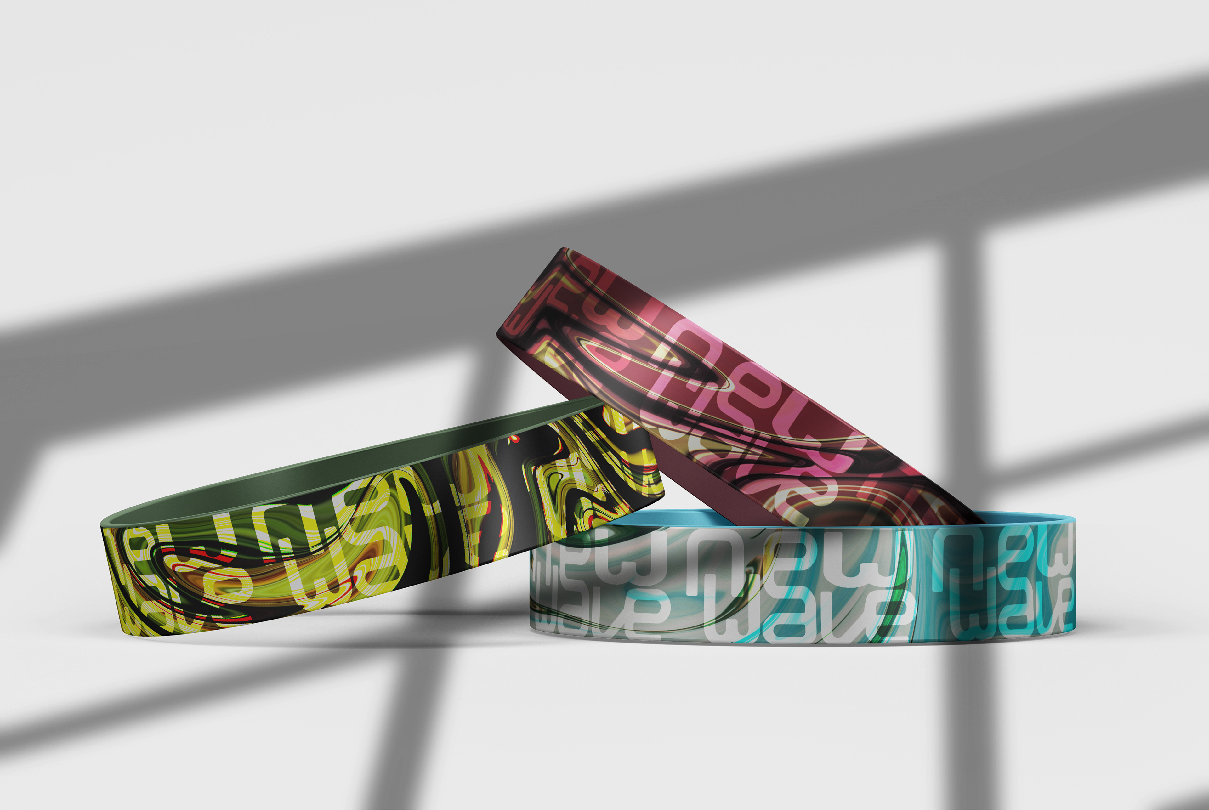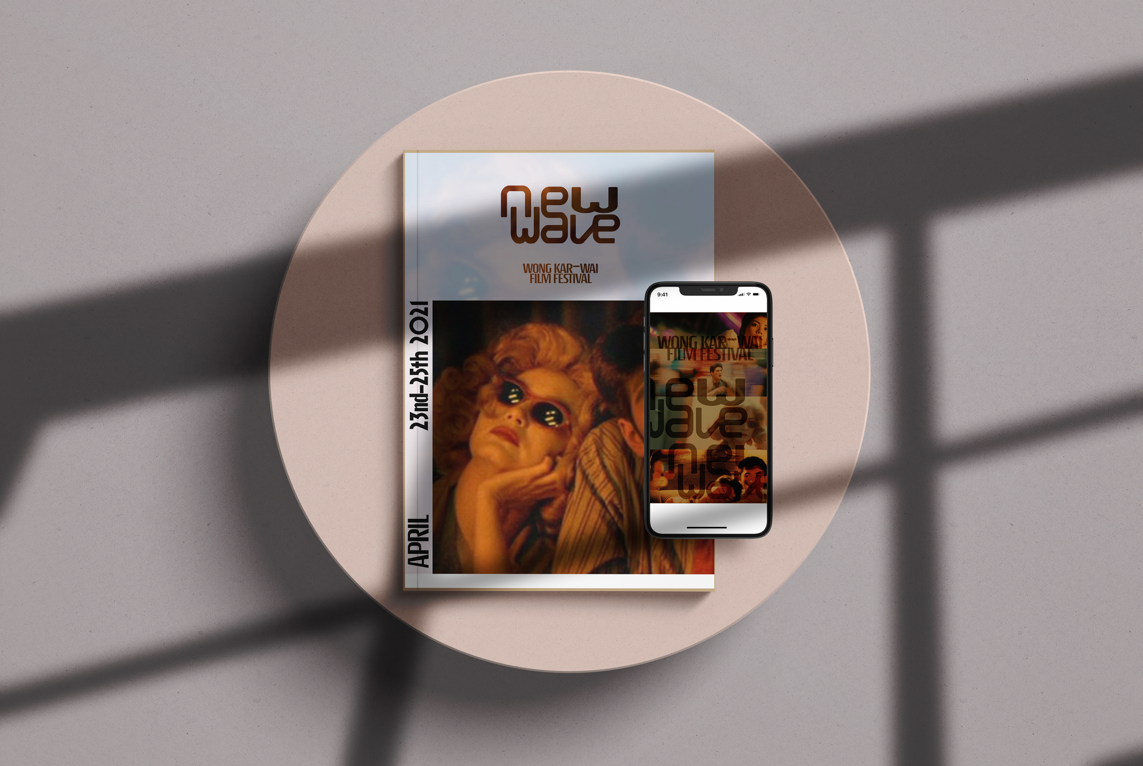
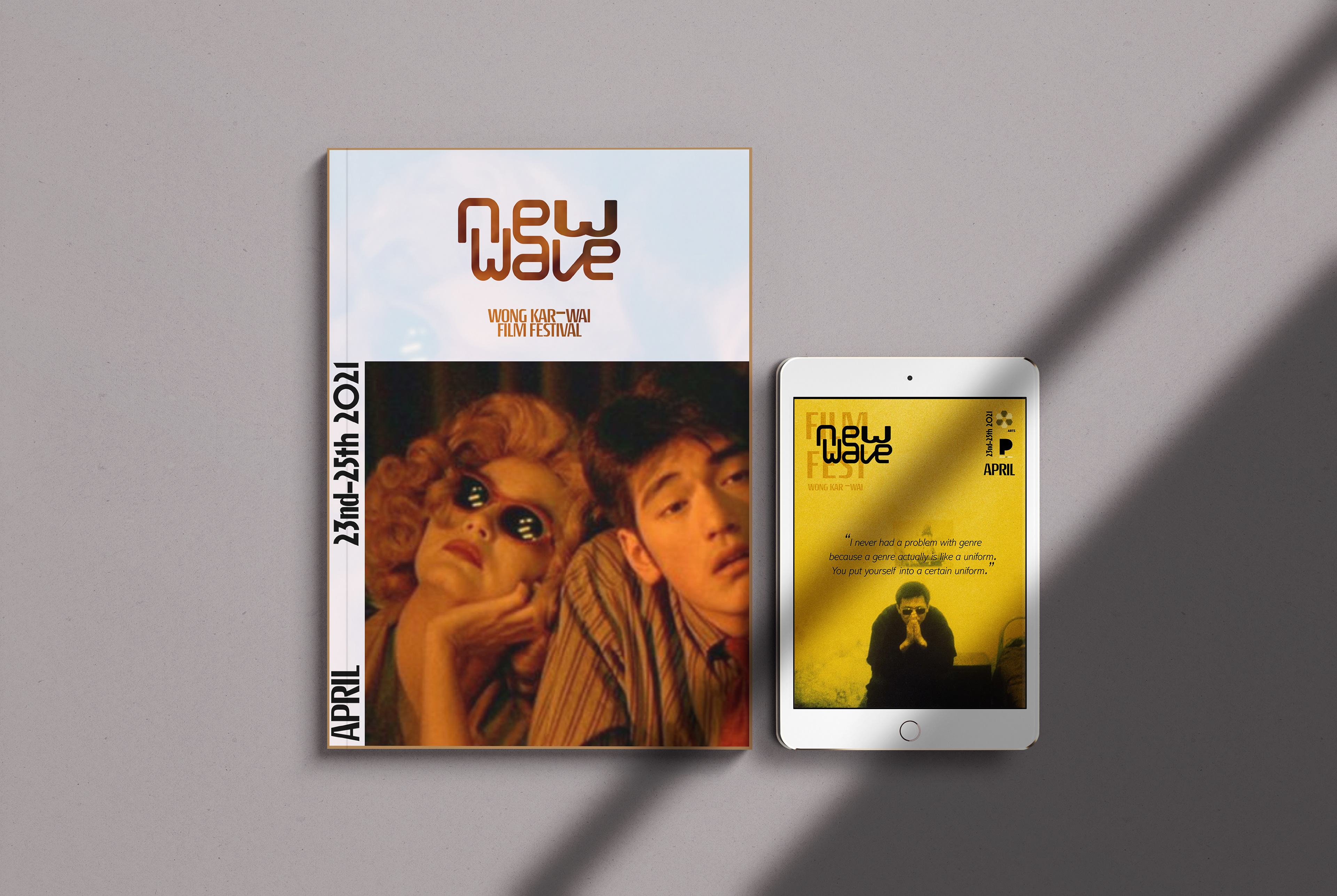
Mastering the colors and lighting is my goal in this booklet design. Wong creates shimmering
visual landscapes saturated in striking colors with hazy neon lights throughout his cinema
photography. He often uses warm (red, yellow) and cool colors (green, blue, and purple) to
fill the frame.
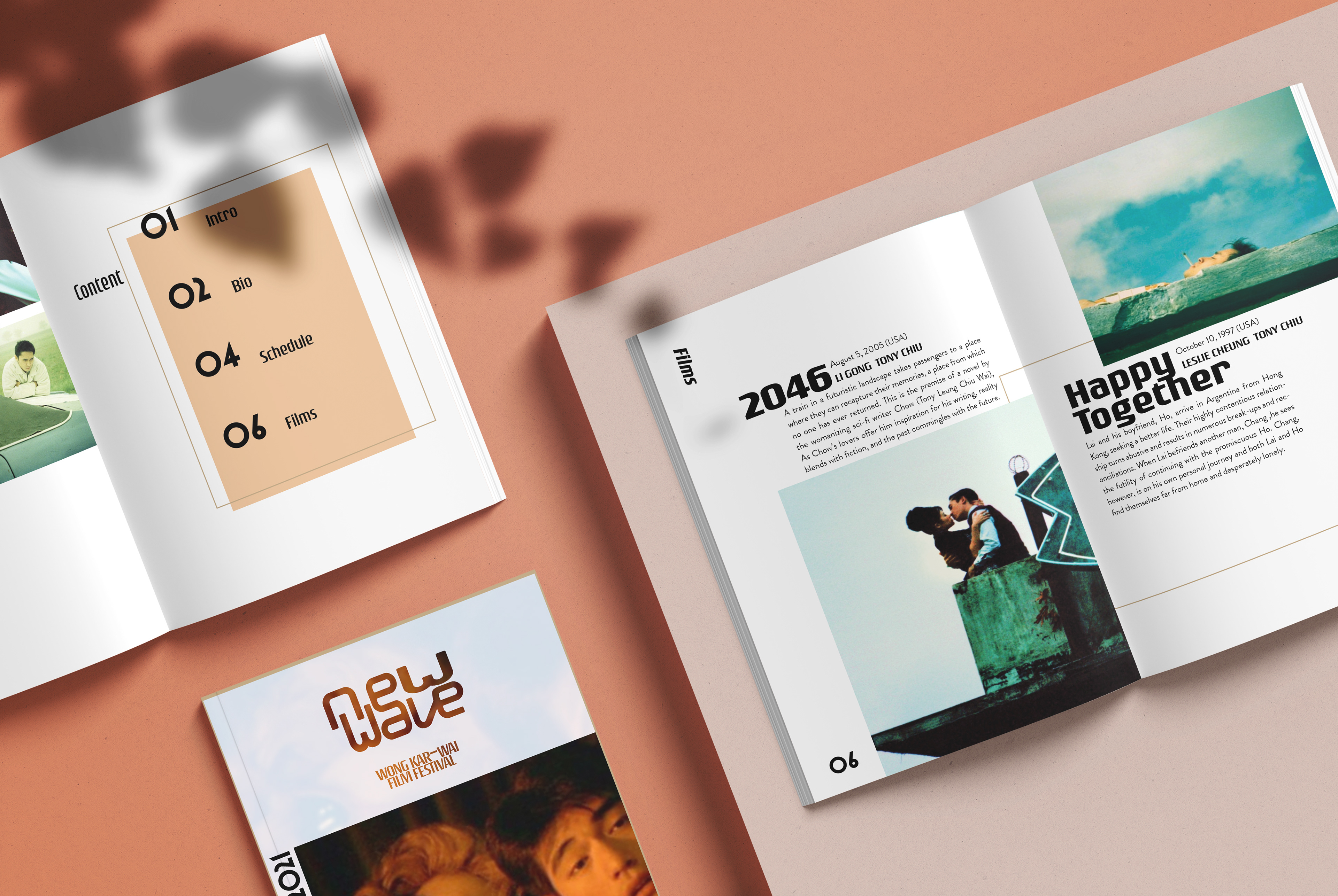

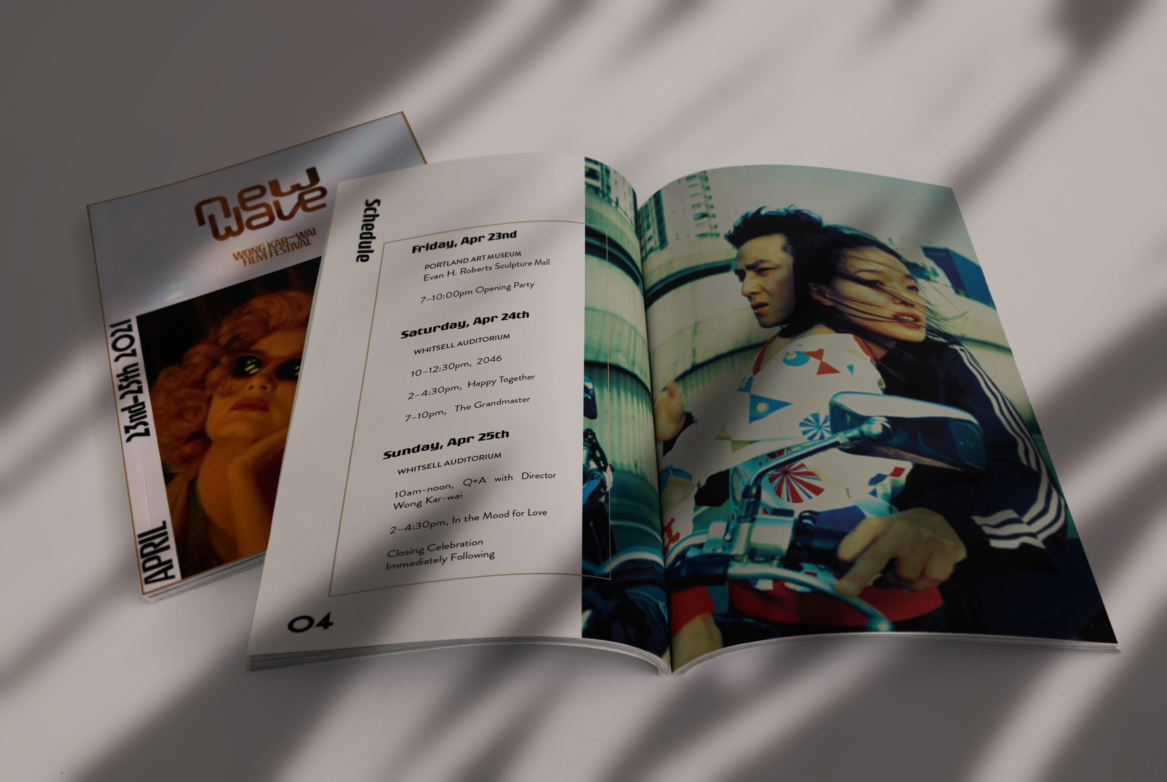
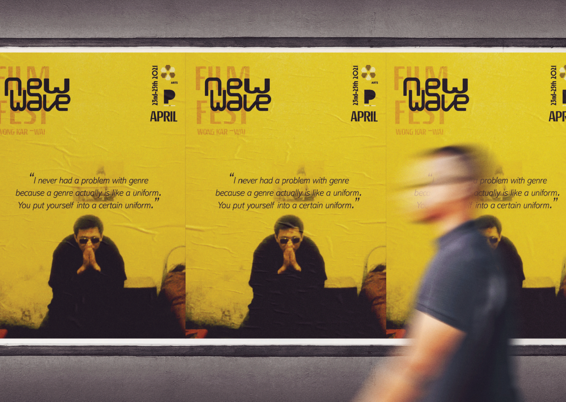
The booklet is laid out as an editorial as this fits my choice to focus on photographs
in order to create a nostalgic design tone. I tried to keep the imagery original and
follow the grid system. For certain photos, I repeated box-line elements throughout the
booklet to keep consistency. I used various scales of imagery to add a different dynamic and
energy to the design. The overall aesthetic of the brochure is modernist, colorful, and nostalgic.
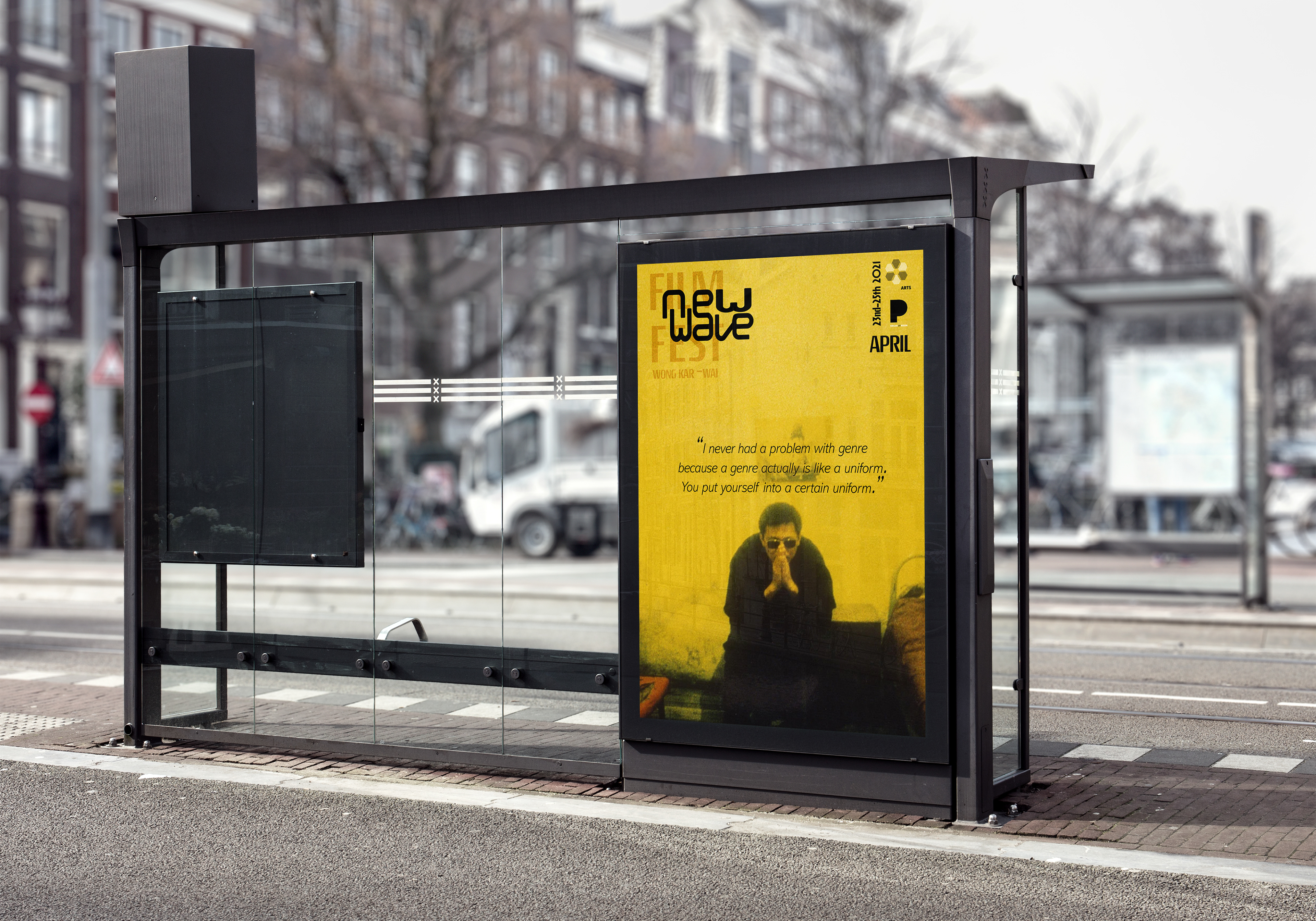
It reflects Wong Kar-wai as the new wave filmmaker in the 1980’s and 90’s of Asia.


By the 1970s, Hong Kong’s film industry was world-renowned for Kung-fu action flicks.
However, a group of innovative directors brought a new approach to cinema, such as
Wong, who gave a different voice for his atmospheric films about love, memory, longing,
and passage of time. The logo idea of the “New Wave” came from this concept.
Wong started a new wave to represent his ideas and draw international attention to
his films. For the wordmark of the subtitle, I used Moby font, featuring a bold, rounded,
and dynamic look which provides a free, playful artistic style. I intentionally connected
few letters, drawing viewers’ eyes toward the center, reinforcing the central concept.
then I chose the clean looking Rouge Sans for my body copy and simple sans serif typeface
that allows the graphic elements within the identity to stand out.